Posts

Glorfindel and the Balrog: Visual Elements

Image
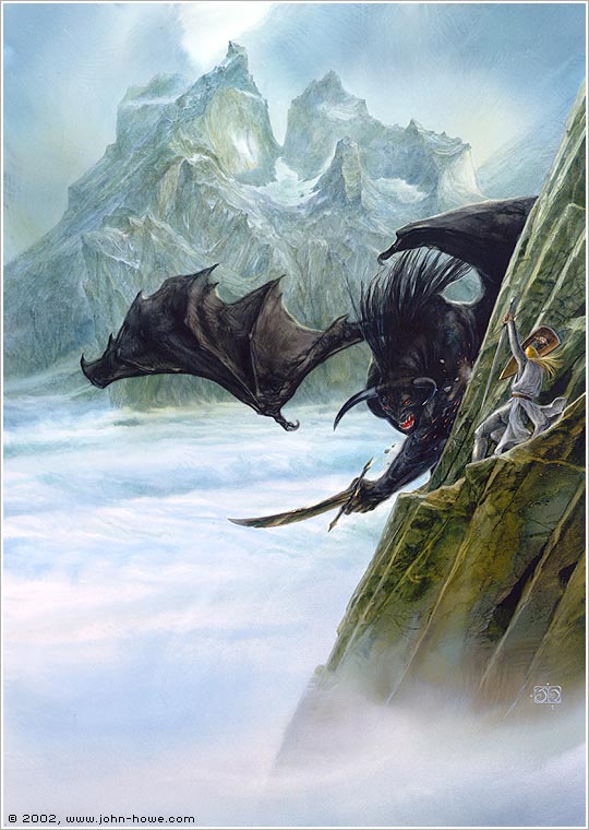
I think I just wanted an excuse to talk about Glorfindel. Obviously I’ll talk about the visual elements as usual but...Glorfindel. This is the only piece that isn’t specifically The Lord of the Rings. This scene comes from The Silmarillion and other histories of Middle-Earth, like The Fall of Gondolin and such. Yeah, the stuff that no one understands when you have obscure references on your t-shirt. Some guy at work thought The Silmarillion was connected to Harry Potter. Just, no. Line: The first thing that stands out is obviously the diagonal cliff face they’re standing on. Second is all the lovely curvy lines of the mountain in the background. Shape: That mountain is just really fun to look at. It seems to have impressive mass. Value: There is a nice contrast between the elements in the foreground compared to background. It’s obvious where the focus is. Color: The red of the balrog’s mouth and eyes pops against the other colors, but it still doesn’t draw too much...

Flight to the Ford: Visual Elements

Image
Part three of this Visual Elements “series” is taking a look at John Howe’s Flight to the Ford. It has a lot going on so there should be plenty to say. Line: The figures seem to be creating a psychological line as the riders rush into the foreground. Your eyes can follow it easily. Shape: I just love the shape of the horses in the water. That’s all. Value: There’s great contrast in value between the water and the black rider. Color: Everything kind of has a cool tone or hue to it. Even Frodo and Asfaloth (Glorfindel’s horse) are almost reflecting back the color of the water, and the warmer colors are understated. Texture: The water has a nice frothy texture, and also the detailed crevices in the rocks. Space: From the relative size of the first ringwraith compared to Frodo you can see how close he is to over taking him. Time and Motion: The entire piece speaks about time and motion. The positioning of the horses and riders, the frothiness of the water, ...

Gandalf: Visual Elements

Image
Continuing the theme for this month of visual elements, this week I’m going to be discussing this portrait of Gandalf by John Howe. I love so many things about this piece. Also, it’s kind of calming even though Gandalf looks annoyed as hell (but when is he not annoyed as hell?). Line: The tree cuts a diagonal line right to the middle of the composition, but it also frames Gandalf’s face. It’s kind of like he’s sneaking around in the woods and is just peeking around the corner. Shape: The leaves and mushrooms have a very organic shape to them. Value: The differences between light and dark aren’t very drastic, but you can tell where the light hits things and see the shadow underneath. Color: Like in The Dark Tower the colors are soft and muted almost, but this time they have an autumnal feel, like the aging of the world. There’s also a nice contrast between the orangey-red of the leaves and the cool colors of Gandalf and the background. Texture: The individual ...

The Dark Tower: Visual Elements

Image
This month I’m taking Digital Illustration. I’m both excited and intimidated. I can’t wait to see what kinds of things I’ll get to create, but I’m not looking forward to finding out how much stress I’ll be under. We’ll be working with Adobe Illustrator some more, and while I understand it’s usefulness and can manage my way around, I don’t know if I’ve warmed up to it yet. I won’t give up on it though. For the next few weeks I’m supposed to blog about the visual elements used in artwork by an artist of my choice. While we’re going to be using Illustrator, this class is focusing more on art and design from a composition standpoint. And true to Bridgetarian format I picked John Howe, who, if you don’t know, is famous for his Lord of the Rings artwork and did conceptual art for the film trilogy. The visual elements of art are: line, shape, value, color, texture, space, and time and motion. The piece I’m going to talk about today is called The Dark Tower. Line: The lines of Barad...

Brand Identity

Image
I never sat down and made a list of things to blog about like I said I would. I was stumped for a few days as to what to blog about for the fourth and final week of class on marketing and self-promotion, but then I figured it couldn’t hurt to share about what we’ve been doing in class. Our project(s) for this month was to design a new logo for an existing company, and subsequently things like a business card, stationary, and a website mock-up. This week we’re designing take-out menus. (I knew this project was coming so I chose accordingly so I could be consistent). The business I chose is a small, local restaurant right by where I work called Garden Bistro. It’s a cute little place with great food and a great view. As part of the “self-promotion” aspect of this class I should probably go over there and say “Hey, I’m redesigning your brand identity for school. Here’s what I’ve done, let me know what you think. I’m willing to let you use it for a minimal fee of my tuition.” Just kidd...

Aquarium

Image
Last week I wrote in length about the covers of The Two Towers. You didn’t know what you were getting yourself into, did you? This week I’m going to write briefly about a music lyric video. Which I will also share below, so you’ll know what I’m talking about and you’ll know what kind of music I like. Nothing says more about a person than their taste in music. The styles of music I listen to most often are cinematic instrumental (a.k.a. music that sounds like it would be from an epic fantasy film, or literally just Howard Shore’s Lord of the Rings score on repeat), symphonic power metal, pagan folk music, gothic rock, or as a general rule anything written before 1990 is acceptable. The video I’m going to share is of a song called Aquarium from Dark Sarah’s album The Puzzle. I believe Dark Sarah is classified as cinematic metal? All of the Dark Sarah albums follow a story, but it’s not pertinent to know to enjoy the music. As far as professional lyric videos go I don’t know if...

The Two Towers: A Comparative Book Cover Analysis

Image
I happen to own two copies of The Hobbit and The Lord of the Rings. I did not set out into the world with this intention. It just happened. All because I have an amazing best friend who knows me as well as I know myself and gives excellent Christmas gifts. The first copy I bought for myself (surprisingly much later in my life than this obsession interest began). I went on a ridiculously lengthy hunt for different book covers, and illustrated versions, and ultimately went for the movie art because...uh no one really wants to know the tedious specific reasons. One copy of a book is usually enough, but now I have two so it won’t make a difference if I end up with every edition of The Lord of the Rings on my shelf, right? It was on this hunt that I found the most fantastic book cover I have ever seen in my life. I mean that in all seriousness. Just wait. My best friend knew about this cover because, as she’s my best friend, I told her immediately. She found the whole set by accident ...